
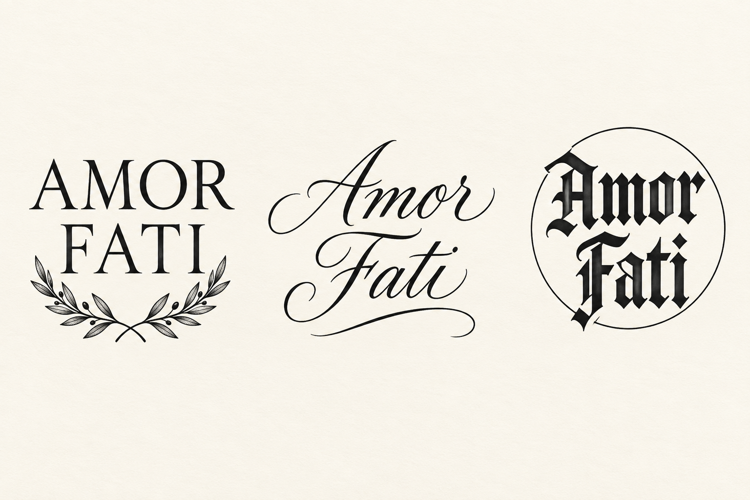
Amor fati: serif, script and blackletter
Three original AI lettering layouts show the complete phrase AMOR FATI: two-line serif capitals above leaves, flowing two-line script with flourishes, and blackletter inside a thin circle. Each keeps the words in the same order; no quotation attribution is asserted.
View design and prompt- Left: serif capitals and leaves
- AMOR sits above FATI in spaced serif capitals, with two small inward-facing leafy sprigs below.
- Center: flowing script and flourishes
- Amor and Fati occupy two lines in sloping script, with large capital letters and long curved flourishes.
- Right: blackletter inside a circle
- Two lines of heavy blackletter sit within a thin circle that remains visible around the outer letter strokes.