Curated design concept
Loyalty: cursive, serif & blackletter
Three original AI treatments spell Loyalty in flowing cursive, uppercase serif and dark blackletter. A rising baseline, a small diamond and an underline distinguish the layouts. Compare the actual letter joins before adapting the word to a placement.
Curated concept artwork. Placement tags suggest adaptations of flat designs; they are not on-skin previews.
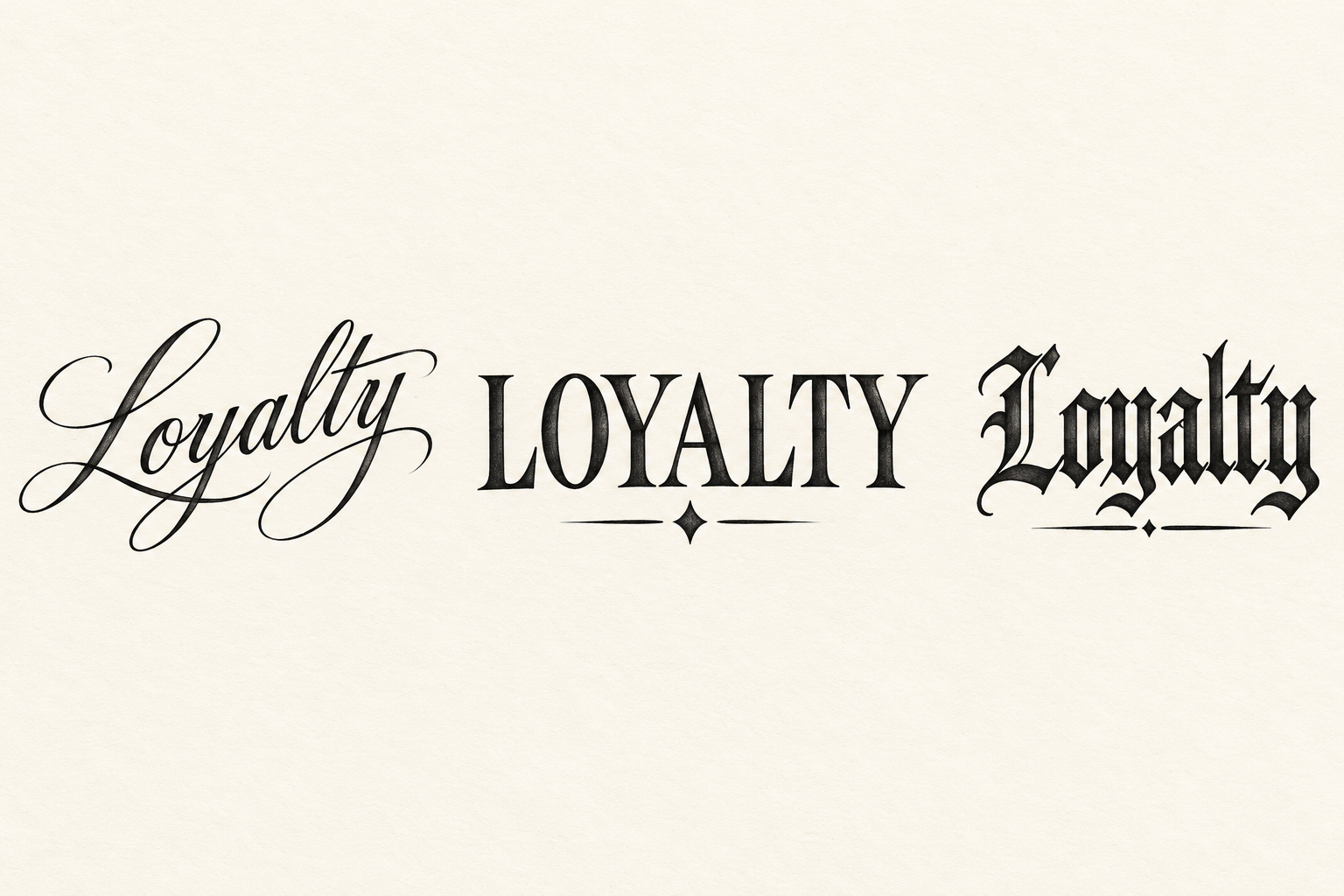
- Left: rising cursive Loyalty
- A long leading L flows into a gently rising word, with an extended ending stroke balanced below the smaller letters.
- Center: LOYALTY serif capitals
- Wide Roman serif capitals sit above a small diamond. Upright strokes and open counters make a broad rectangular shape.
- Right: underlined blackletter Loyalty
- Angular dark lettering is finished by a short underline. The lower line stays distinct from the descending letter strokes.
Reuse this prompt
Change the motif, size or direction before opening the studio. This action sends the text only; the gallery artwork is not attached.