Loyalty: cursive, serif & blackletter
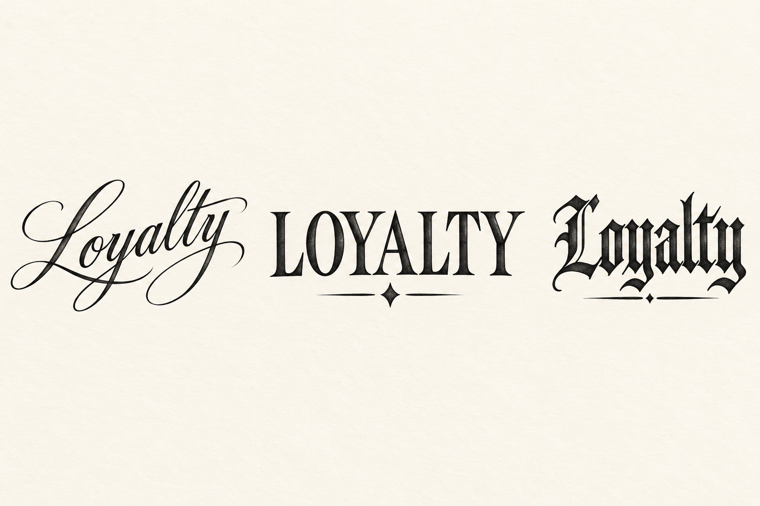
Three original AI treatments spell Loyalty in flowing cursive, uppercase serif and dark blackletter. A rising baseline, a small diamond and an underline distinguish the layouts. Compare the actual letter joins before adapting the word to a placement.
View design and prompt- Left: rising cursive Loyalty
- A long leading L flows into a gently rising word, with an extended ending stroke balanced below the smaller letters.
- Center: LOYALTY serif capitals
- Wide Roman serif capitals sit above a small diamond. Upright strokes and open counters make a broad rectangular shape.
- Right: underlined blackletter Loyalty
- Angular dark lettering is finished by a short underline. The lower line stays distinct from the descending letter strokes.