
Fear None: script, serif & blackletter
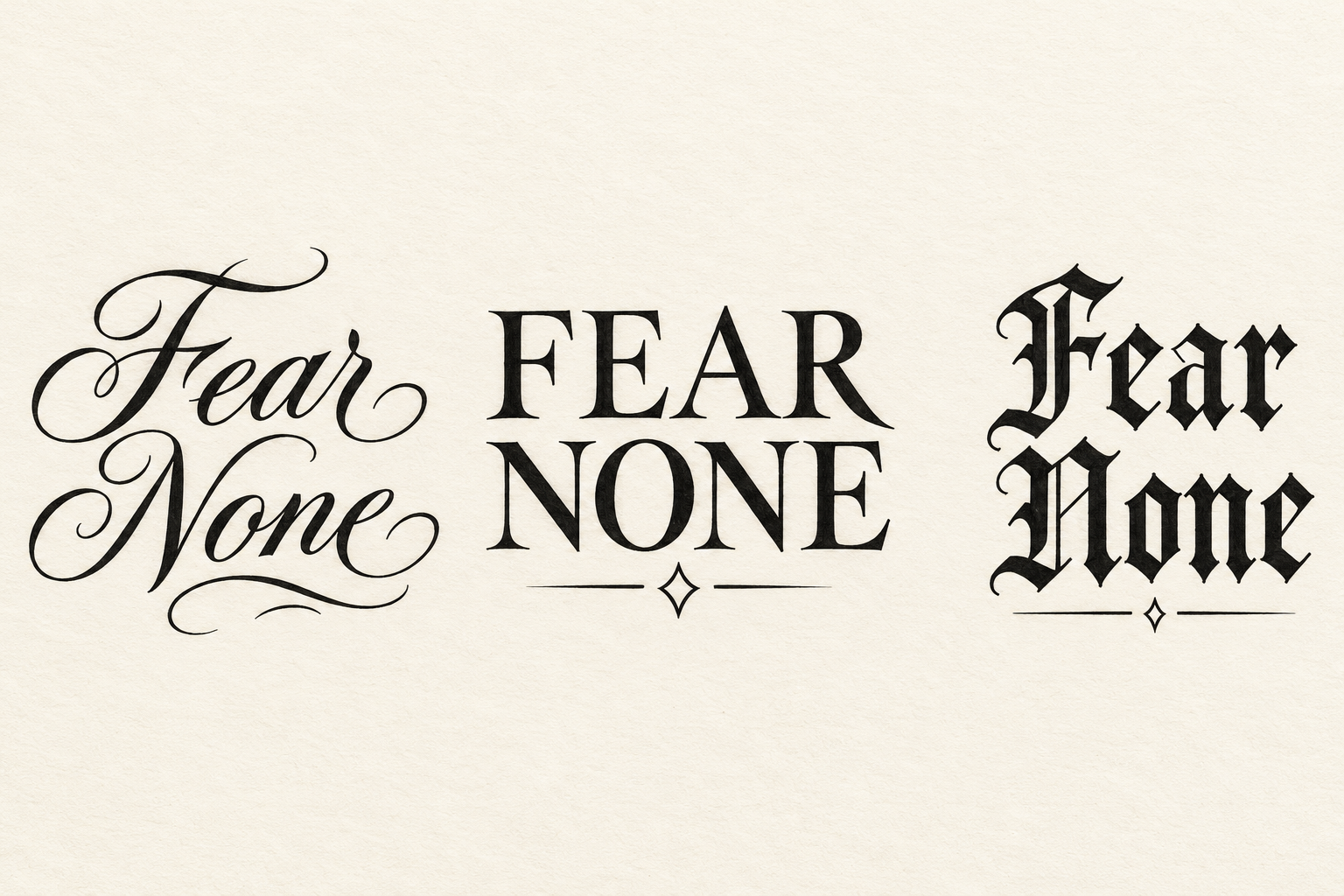
Three original AI lettering treatments spell Fear None in script, Roman capitals and blackletter. Each places Fear above None, with different stroke weights, small finishing marks and open margins for comparing the complete phrase.
View design and prompt- Left: flowing two-line script
- Fear None uses connected script and short flourishes, with the two words stacked and their curved strokes kept apart.
- Center: FEAR NONE capitals
- Upright Roman serif capitals form two firm lines above a small open diamond. Broad counters balance the heavier strokes.
- Right: Fear None blackletter
- Dark angular letters form a compact stack with a short underline. Clear spaces separate the word endings from the decoration.